#5 Toronto Maple Leafs

A very simple but timeless logo is what puts the Maple Leafs on my list. The Maple Leafs logo has had numerous variants of itself over the franchises extended history, but this is the latest version that they have been using since 1970. The reason I like this logo so much is that it executes the concept of not being too busy but still being full enough to be very pleasing to the eye. It is a symmetrical logo that pays a little homage to the flag of the country the team resides in. A very pleasing logo all around.

Maple Leafs logo history
#4 Boston Bruins

The spoked "B" of the Boston Bruins is a logo that can be recognized around the entire world of sports. The round shape of the logo is something that I really enjoy and makes the logo very appealing. Black and gold contrast beautifully together and the Bruins pulled it off with flying (two) colors. This more-outlined version of the logo has been the Bruins moniker since the 2007 NHL rebranding season and the people in Boston's design department absolutely nailed this one. The eight-spoked B is a classic that fits well with the teams reputation: big, bold, and bruising.

Bruins jersey history
#3 Detroit Red Wings
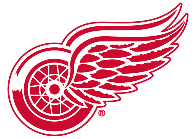
The Detroit Red Wings logo is a complete embodiment of the city of Detroit's spirit. The winged wheel is something that screams the "Motor City". It is just a very appealing and quick-looking logo that is not too busy. The logo almost smells like burning fuel coming out of a Ford and it is faster than a Mustang. This version of the Wings logo has been in use all the way back to 1946 and will not be changing any time soon.

Red Wings logo/jersey history
#2 Montreal Canadiens

Here at number two we have probably the most classic logo in the NHL: the Montreal Canadiens logo. 1956 brought us one of the best logos in all of sports. A common miss-conception with the logo deal with the "C" and the "H" that don it. The "C" actually stands for "club" and not "Canadiens", and the "H" really stands for "hockey" and not the widely assumed "Habitants" or "Habs" for short. I love that they incorporated two different letters into one shape making it look like one whole logo. It is the best logo out of the Original Six teams and will forever be a classic in the NHL.

Canadiens logo history
#1 St. Louis Blues

Ah, the Bluenote. My favorite logo in all of hockey. For a team named after the music history of the city it calls home, this logo is a top notch and is bold, sharp, and proud. In my opinion it is the most appealing and well-put-together logo in the sport. The Blues logo that also makes the home and road jerseys look extremely good. Ever since the Blues dropped the red trim from their look in 1998, their logo quality has shot through the roof. The best NHL is something to behold, and is quite the beauty to look at.

Blues logo history
No comments:
Post a Comment